.png)


.png)


The FIFA World Cup is back in the United States for the first time in 32 years. Much has changed on and off the pitch for Team USA since 1994, but some things look strikingly familiar.
There’s real noise ahead of the tournament: polarized debate over stadium locations, geopolitical tensions and fluctuating ticket prices that lock out everyday fans. Yet beneath the digital frenzy, sports marketers are navigating the unprecedented challenges tied to FIFA’s new three-nation hosting format:
But the most interesting pre-tournament story of the summer isn’t happening in the stands—it’s on the kit.
There is no bigger brand lever for football federations than the iteration of their actual on-field jerseys. Design teams work years in advance while federations drop their new World Cup kits in the months leading up to the tournament to build pride and generate hype across fan networks.
In 2022, the American kit, along with the U.S. team’s World Cup performance, was forgettable. Fans bemoaned the “templatized” kits that many federations sported. These blueprinted jerseys minimized the flair, unique visual IDs and patriotic pride that the World Cup is known to evoke. And it’s not just fans—U.S. captain Tyler Adams said he didn’t quite feel that the ’22 jersey “represented the country as we’d like.”
This year, Team USA partnered with Nike to ensure this did not happen again.
To initiate a rebrand, Nike dug deep into the team’s roots to understand exactly why the 1994 jerseys in particular became so deeply ingrained in the American soccer brand story. Relatively new to the global soccer stage when it hosted for the first time in ’94, Team USA wore brash kits designed to represent American culture, reject notions of traditional European football elegance and reflect the unruly wild card energy of the sport’s massive coming-out party on home soil. The U.S. forgot to follow the rules.
Contrasting with the typically clean and solid color convention, Team USA’s ’94 jersey was eye-catching and divisive: white stars stretched across a denim-like fabric inspired by the national flag. The Athletic called it a “beloved abomination.” The alternative jersey had a white base with vibrant, wavy red stripes in another abstract salute to the flag. The kit transcended its original purpose as game uniform and became a style statement, influencing not only soccer apparel but also American streetwear and fan fashion.
Next, Nike carefully considered which elements to keep from ’94 and which to evolve for the modern market.
To do this, it consulted regularly with players as the designs evolved. In prior years, players were interviewed for their sentiments before the work started, but Nike made them an integral part of the brand conversation for ’26. From the earliest meetings to the final product, the players were in the room. They wanted a kit that could tie back to ’94 but also showcase Team USA in its latest instance. In the words of the soccer stars, they wanted one kit that was “timeless” and another that could be “worn to the club.”
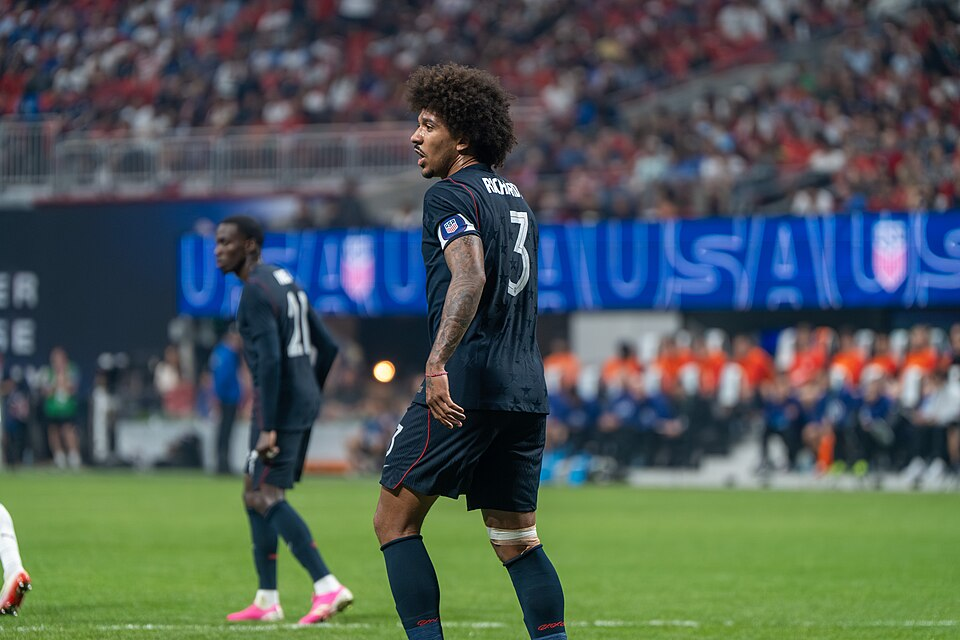
The ’26 home jersey again runs a sharp red wave pattern across the full body—a design that directly references the flag-like alternative kit of 1994. It reads as a vintage Nike jersey brought forward without being a copy. Nike evolved the jersey while firmly honoring the history of both the nation and the team. The away kit is a blacked-out reimagining of the iconic denim stars from the 1994 World Cup, featuring oversize tonal stars on a deep carbon base and a monochrome badge. This jersey has a quieter confidence, and it works.
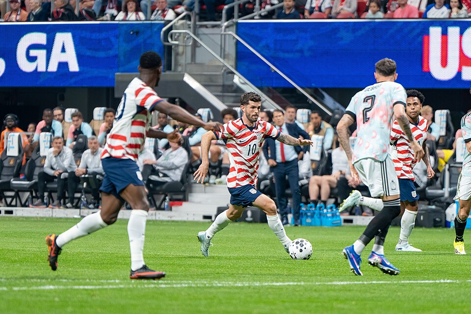
The stripes are still there. The stars are still there. But the designs now carry the weight of a much bigger audience—they comprise one of the largest kit rollouts in U.S. Soccer history. The American soccer brand has scaled without diluting its identity. The two ’26 kits were designed to serve two different audiences simultaneously: the red-stripe jersey offers a loud and proud patriotic print for fans, while the darker flag-star jersey is a lifestyle edition that can be worn off the field without making too much noise.
One brand, two expressions, different entry points into the brand for different segments. Nike saluted the team’s roots by building on what was already proven, but it also took stakeholder sentiment seriously. The kits signal a brand evolution designed for modern football audiences who express fandom in different ways.
The strategy behind the evolution of the federation’s brand and its kit designs highlight a number of brand principles that inform the work at VSA Partners:
So how do you evolve your brand without diluting it? Start with what’s true about your brand and hold it up against where your audience is today. Then build something new from that. The ’94 kit was bold because the moment demanded it. The ’26 kit is confident because the work earned it. Evolution doesn’t erase history—it simply proves you understand it.
Want to discuss what strategy-led evolution of your brand would look like? Let's talk.
.png)
